Many designers believe that creating mockups for mobile, tablet, and desktop is the same thing as designing responsively. It feels thorough. It looks organized. It fits neatly into a Figma file.
It's also not quite right.
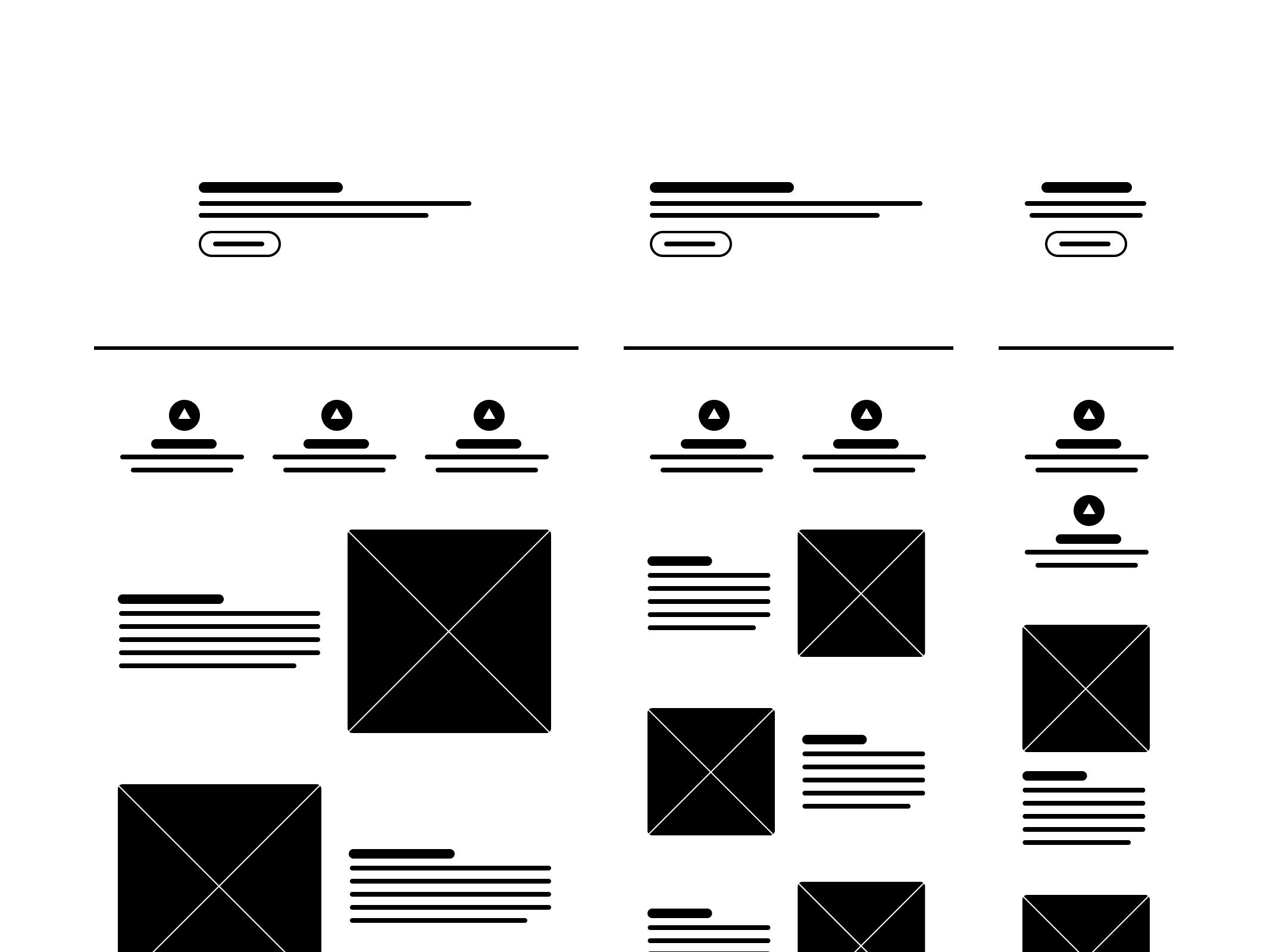
You could mock up every common screen size found in your analytics report, add breakpoints to your heart's content, and still end up with a design that buckles the moment a user resizes their browser window. Because what that process produces isn't responsive design. It's a well-intentioned approximation of it. A series of educated guesses, presented with great visual polish.
This isn't a criticism of designers. They're working with the tools available to them. The issue is that those tools were built on philosophies that have never reflected the medium they're designing for.
The Legacy Of Print Top
Let's rewind. When the web was young, it borrowed heavily from print. Pages, margins, headers, footers, templates. The vocabulary of print gave the early web a familiar structure, and that made sense at the time. But as the web evolved, that vocabulary quietly became a constraint.
Print is static. It assumes fixed dimensions, a known canvas, a controlled environment. The web is none of those things. It stretches, shrinks, rotates, and reflows across an enormous range of devices, screen sizes, and user behaviors. Applying print logic to the web is a bit like using an oral thermometer to check the weather. The tool simply wasn't built for the job.
Figma is the obvious example to examine here. It's an exceptional tool, and features like auto layout genuinely moved the craft forward. But even at its best, Figma simulates responsiveness rather than achieving it. Compared to what's actually possible in CSS with flexbox, grid, container queries, and relative units, Figma is working with a meaningful handicap. You can get close. But close and responsive are not the same thing, and the gap between them tends to surface at exactly the wrong moment.
Real responsiveness doesn't live in design files. It lives in code.
Static mockups create three recurring challenges that are worth addressing directly.
The first is design debt that lands on engineering. When developers receive a collection of screen-specific mockups, they're implicitly being asked to invent everything in between. That's not a handoff, it's a scavenger hunt.
The second is wasted time and money. Recreating the same screen at five different sizes isn't a design process, it's a production bottleneck. The effort spent maintaining that many discrete mockups rarely justifies the return.
The third, and perhaps most significant, is the gap between mockups and reality. Designing for three screen sizes means ignoring everything outside of them. And "everything outside of them" turns out to be a substantial portion of how real users actually experience software. People split-screen. They resize. They switch from a laptop to a phone mid-task. Those aren't edge cases, they're everyday behaviors, and they deserve to be designed for.
Designing For The Medium Top
At some point in every project, design becomes code. That's not a threat, it's just how the web works. The browser is the final canvas, and no design tool, however sophisticated, is the browser.
This doesn't require designers to become developers. But it does suggest that a working understanding of how the web behaves, how CSS cascades, how flexible layouts flow, how content responds to its container, meaningfully improves the quality of design decisions. You can't design scalable solutions for a medium you don't understand, at least not reliably.
The good news is that this is changing. Slowly, but genuinely. AI-assisted design, component-based workflows, and live prototyping tools are beginning to close the gap between design and code. They're giving designers a more accurate understanding of the medium they're working in, without requiring them to write it from scratch.
The goal isn't to turn designers into engineers. It's to give them tools that actually understand the web. Tools that produce flexible, living interfaces rather than static snapshots of what an experience might someday look like.
Because when design is built for the medium rather than around it, the guesswork drops away. And what's left is something that actually works in the wild, not just in the file.