One persistent myth in product circles is that more information equals more value. Somewhere along the way, a well-intentioned decision was made to show users everything at once. Every dataset, every tab, every metric all competing for attention on a single screen. The result, more often than not, is an interface that overwhelms rather than empowers.
The irony is that this approach achieves the opposite of its intent. More data doesn't produce more clarity. It produces more noise.
The science backs this up. Cognitive researchers have understood for decades that human working memory is a limited resource. Nelson Cowan's foundational work established that the brain can only hold a small number of information "chunks" at any given time. More recent research from Garavan, McElree, and Oberauer suggests that number may be as small as just one chunk. When an interface ignores these constraints, users don't become more productive. They slow down, make more errors, and spend more energy just trying to orient themselves.
Hick's Law established in 1952, reinforces the point. The more choices presented to a user, the longer it takes them to make a decision. This isn't a quirk of human laziness, it's a fundamental feature of how the brain processes information under load.
The good news is that the solution is well within reach. So, let's talk about space.
The Space Within Top
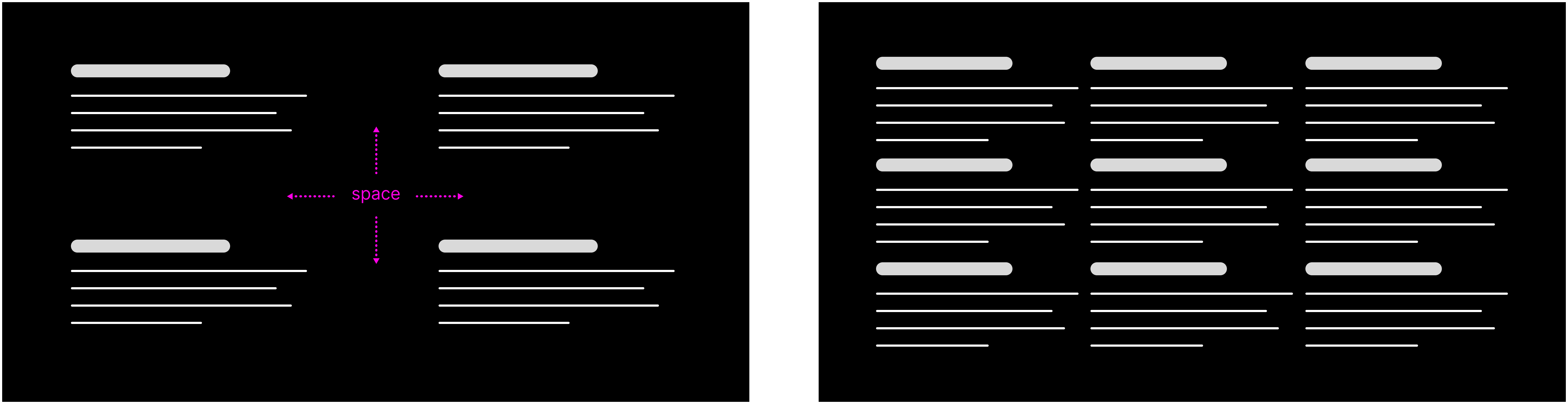
One of the most underutilized tools in interface design is empty space. Within a single view, whitespace does something that borders, dividers, and visual hierarchy alone can't. It gives the eye, and by extension, the brain, room to breathe.
Clean, open layouts reduce the effort required to parse information. They remove the visual clutter that forces users to work harder than they should. A well-placed margin or a generous line-height isn't a design indulgence. It's a deliberate act of clarity.
The Space Between Top
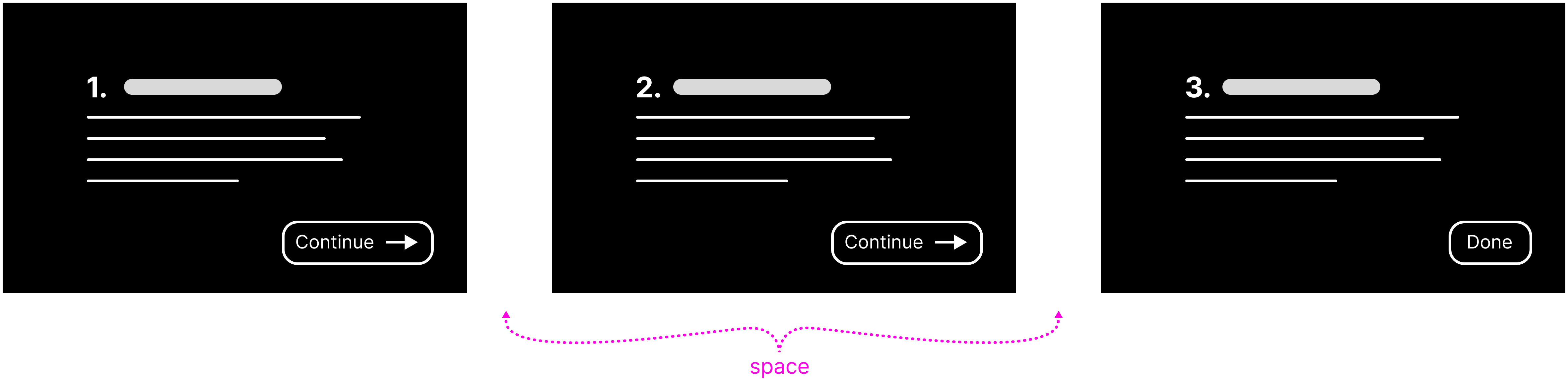
The same principle applies across views. Rather than presenting users with an overwhelming volume of information in a single screen, progressive disclosure distributes cognitive load across time. Each transition between views acts as a natural reset, allowing users to focus on one thing before moving to the next.
Hyperlinks are a simple but elegant illustration of this. A click takes the user somewhere new with a single, focused purpose. When used appropriately, that moment of transition isn't an unnecessary delay. It's a feature.
Of course, balance matters. Spread information across too many steps, and navigation becomes its own burden. Every unnecessary click is friction. The goal isn't to make information hard to get to. It's to sequence it thoughtfully, so that what users see at any given moment is exactly what they need without distracting fluff.
The Space-time Continuum Top
That leads me to an interesting observation. Density affects the perception of time in cognitive science just as it does in physics. The way gravity stretches time around massive celestial bodies — dense, complex interfaces actually feel slower to use. Not because the technology slows people down, but because the brain requires time to process what it's seeing. Cognitive overload creates a very real sense of drag.
Conversely, well-organized interfaces, where content is logically chunked and thoughtfully paced, feel faster and lighter, even when the underlying data is substantial. The experience of using them is simply easier, and ease translates directly into efficiency.
By respecting the brain's limits and designing with intention, we can create interfaces that not only look better but feel better to use. It's not about making things pretty. It's about making them work in harmony with how people think and process information.